Good morning all!
Not sure what the weather is where you are, but here in the St. Paul Area, we woke up to snow on the ground on Monday morning! Wow! Welcome to living in the Midwest!
Today let's talk color! I ran across a great issue of House Beautiful and there were so many sources on color personalities that it prompted this post.
Everyone has a "color personality." Do you know what yours is? Depending on who you ask, or where you do your research, you might have a couple different answers to that question.
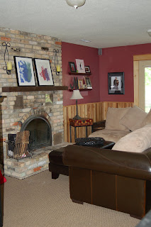
I can guess mine, but in all honesty, it depends on the day. If you were to glance around my home at my interior, my color personality will lean toward warm, rich, and deep colors. I use alot of deep eggplant, rustic red, chocolate brown, and caramel to name a few of the colors. I like to accessorize with black but also veer sometimes.
I think a good designer can pull in different items and make one cohesive look. Shall we say, eclectic? The safest thing one can do, is match. Thats why people match. It is safe! They know it looks good! (What was that slight whisper in my ear? - Oh yeah, matching is also, shhhh, whisper, - BORING.)

Go into any of the furniture stores. Look around? What do you see? I know, matching sets of everything. Matching sofa, loveseat, and chair combinations. Matching occasional table sets. Even matching headboard, bedside tables, and case pieces. Get over the matching!
According to color expert Leatrice Eiseman (morealivewithcolor.com), you can categorize your homes color personality into the following four color times: Sunrise, Sunset, Sunlight, and Crossovers. Check out the description and decide which is your best "color time!"
Sunrise: Your decorating palette veers toward the cool colors and is inspired by natural elements such as air and water. Your interior decorating palette will sparkle and shine with tones of amethyst, orchid, emeralds, and royal blues. Cool grays, mauvey-taupes, and rosey-beiges are good neutrals for a "sunrise" palette. The best white for a "sunrise" is pure white - taken from the pure white of snow.
Sunset: A "Sunrise's" decorating palette moves toward the warn color spectrum and is inspired by such natural elements as fire and earth. Your interior palette will include terra-cotta, ginger, burnt coral, apricot, and caramel colors. You can also flash some of the exotic colors such as iris, orchid, and deep periwinkle. Your neutrals are warm taupes and camel tones. The best white for you is a warm white.
Sunlight: As a sunlight, you will pull from both the Sunrise and Sunset color palettes. All of the elements are present. Air, Fire, Water, and Earth. Great colors for a "sunlight's" interior palette would include custards and peaches. You might also choose a delft blue or cornflower. For a visual, "Think of verdant green meadows under a placid blue sky. The best neutrals for a Sunlight are taupes and the best whites have pastel undertones to them.
Crossovers: A crossover palette is most often referred to as the "basic" or "classic" scheme. A crossover has great basic neutrals like sand, khaki, taupe and gray. Crossovers are the most versatile and can be used in any combination of any of the other color time palettes. Crossover, your best colors are in the deep tones. Chocolate browns, eggplant, wine, teal, navy blues and black as an accent color for you. Crossovers, like the deep tones for adding richness. The best white is off'white.
From the looks of my home; I would categorize my color time palette as somewhere between a sunset and a crossover. Probably a 50-50 split. I love the deep colors but I also love the warm reds, and carmels too. There is no right or wrong to the theory of color personalities. Just like there is no right or wrong to choosing a name. It just fits!

Mickelson Residence - Lower Level Family Room
