Thursday, December 30, 2010

So long 2010...Hello 2011!


It's hard to believe that 2010 is just hours from being over! WOW! I look back and ponder the things I am thankful for. My health (of course), my wonderful husband, my 2 amazing children, my family, (who is ever so supportive), and my wonderful wealth of friends. God has blessed me with many things in 2010. All of them I am thankful for.


For 2011...I look forward to the many more blessings I will receive. My goal for 2011...well...I have many.


Things to come for BrynnAlden:
A new website...with the close of the store in 2008, we shut down the website. It is time again to get a site up and running along with my blog. Wish me luck!


Design in a box...I have to come up with a new name. A professional decorator by the name of Windsor Smith has developed this concept. I think it is brilliant...this is something I plan to incorporate as a service to my clients.


Event & Pary Planning...Design is more than pillows and curtains. I know you are all shocked, but it is true. I will be adding event and party planning to our service list in 2011. From kid's birthday parties to corporate holiday parties, we will offer planning services for your special events.


New-Park Lions are also on my agenda...I will be joining the New-Park Lions Club. I haven't been part of professional community service organization since Key Club in high school, but I have volunteered my time as much as possible at the kids' schools. I think it is important to help in your community. There is always someone in need!


Watch for all these exciting changes in 2011...they are sure to keep you in the loop!
I would love your feedback. If there is something you need help with, there is something you would like to read about, or just plain chat...let me know.


I want to wish you all a blessed, healthy, and prosperous New Year! You deserve it!


Happy New Year!


Kelli

Friday, December 24, 2010

Merry Christmas


Merry Christmas Eve-

I just want to wish you all a Merry Christmas. Wishing you a happy, healthy, and prosperous New Year. See you soon!

Kelli

Friday, December 3, 2010

Christmas Decorating...


I can't believe its already December 3rd! Hopefully the time after Christmas goes by as fast as the fall did!

I was reading the December issue of Traditional Home and thought I would share some thoughts...

One of the articles featured the home of New York Designer Christopher Hyland. It is very beautiful. Not my taste all around but beautiful none the less. This is a picture of his Christmas Tree.

He goes on to say, he doesn't leave off ornaments our leave out Christmas decorations because they aren't "design worthy" he uses all ornaments and all decorations because they are the story tellers of years past.


I totally agree! Each crocheted butterfly on my tree reminds me of my Grandma. Each photo ornament of Don and Ruth remind us all of them. Painted pine cones with glitter remind me how fast my kids are growing. The wind up Santa music box I received from my God Mother years ago also tells a story. "Tiny Tim" sits at the top of our stair well waiting for us...he tells the story of Rick's childhood! Although he needs a little sprucing up every once in a while...he still welcomes us home!


Design is an art. Remember "art" has many faces. There are no rules to "art" despite what some people think. It is very subjective. Subjective to ones own opinion. Design is much the same. There are rules and principles of design. But designers do not use them in the same way. That is what makes us unique in our own design solution.


I hope you all create your own Christmas Wonderland at your own homes. I finally, am putting the finishing touches on mine. Although, it never is exactly the same each year, some things are close.

Happy Holiday Season to you all!

Sunday, August 29, 2010

Mixing finishes and Colors...


Check out the mix of finishes in this kitchen design courtesy of HGTV.com "Old world"?

The mix of not only materials but also finishes. There is a mixture of stone, the granite countertops, the range surround, the tile back splash, and the floor are all different but compliment each other nicely.

Also look at the two different colors of cabinetry...Black for the island and coffee stained wood for the rest. Also the addition of the wood top on the island is a great addition to make the island seem as a seperate "furniture" piece rather than a kitchen island.

Of course, stainless steel appliances. I LOVE the light fixtures too!

Happy Creating! See you soon

Thursday, August 26, 2010

Let's call it "Rich"!


As seen in the July 2009 issue of House Beautiful, Miles Redd has used a very dark blue laquer in the living room shown. He describes it as "rich". I absolutely agree!

Using dark colors on the walls doesn't have to look gloomy and cave like. There is nothing about this room that is gloomy or like a cave. The floors are even dark.

I firmly believe and practice, decorate your home according to your comfort level. My comfort level is a little on the "edgy" side so I am comfortable with dark colors.

Just remember, as I have said before; when it comes to paint, if you don't like it, it's a very easy fix.

See you soon.

Monday, January 25, 2010

Budget Friendly Bathroom Remodel

In one days time and under $100 spent. A small bathroom gets a great makeover.


The client wanted a new look that wouldn't cost a lot of money. Client concerns: Baby blue existing shower tile which is not being replaced at the current time. Black & white existing vinyl flooring which is also not being replaced at the current time.


We removed a cabinet over the commode. This produced a more open feeling. There were too many pieces of cabinetry in a small amount of space and the homeowner did not use the cabinet removed so there was no loss of storage space.


The rustic red wall color was replaced by "Mink" a medium tone gray color. This cooler color complements the black and white existing vinyl flooring. It also better complements the existing baby blue shower tile. The tile is not usually visible with help from a shower curtain.


The new wall color seems to "brighten" the space.


An outdated wooden toilet paper holder was removed, relocated, and replaced with a satin nickel finish replacement on the side of the vanity. The dated faucet was also replaced with a new satin nickel finish. The old brass, cabinet hardware was also replaced with modern satin nickel hardware.

A piece of custom artwork done by the client's son is used over the commode. Existing artwork, rugs, window treatments, shower curtain, and accessories were re-used.


Project Costs
1 Gallon Paint $24 - Faucet $35 - Hardware $14 - Toilet Paper holder $10

Total Project Cost = $83 and one days time. Not bad!

I would love to help you with your remodeling project on a budget.
Email me with your design questions. brynnalden@yahoo.com

Saturday, October 10, 2009

What is your color personality?

Good morning all!

Not sure what the weather is where you are, but here in the St. Paul Area, we woke up to snow on the ground on Monday morning! Wow! Welcome to living in the Midwest!
Today let's talk color! I ran across a great issue of House Beautiful and there were so many sources on color personalities that it prompted this post.
Everyone has a "color personality." Do you know what yours is? Depending on who you ask, or where you do your research, you might have a couple different answers to that question.

I can guess mine, but in all honesty, it depends on the day. If you were to glance around my home at my interior, my color personality will lean toward warm, rich, and deep colors. I use alot of deep eggplant, rustic red, chocolate brown, and caramel to name a few of the colors. I like to accessorize with black but also veer sometimes.

I think a good designer can pull in different items and make one cohesive look. Shall we say, eclectic? The safest thing one can do, is match. Thats why people match. It is safe! They know it looks good! (What was that slight whisper in my ear? - Oh yeah, matching is also, shhhh, whisper, - BORING.)

Go into any of the furniture stores. Look around? What do you see? I know, matching sets of everything. Matching sofa, loveseat, and chair combinations. Matching occasional table sets. Even matching headboard, bedside tables, and case pieces. Get over the matching!

According to color expert Leatrice Eiseman (morealivewithcolor.com), you can categorize your homes color personality into the following four color times: Sunrise, Sunset, Sunlight, and Crossovers. Check out the description and decide which is your best "color time!"

Sunrise: Your decorating palette veers toward the cool colors and is inspired by natural elements such as air and water. Your interior decorating palette will sparkle and shine with tones of amethyst, orchid, emeralds, and royal blues. Cool grays, mauvey-taupes, and rosey-beiges are good neutrals for a "sunrise" palette. The best white for a "sunrise" is pure white - taken from the pure white of snow.

Sunset: A "Sunrise's" decorating palette moves toward the warn color spectrum and is inspired by such natural elements as fire and earth. Your interior palette will include terra-cotta, ginger, burnt coral, apricot, and caramel colors. You can also flash some of the exotic colors such as iris, orchid, and deep periwinkle. Your neutrals are warm taupes and camel tones. The best white for you is a warm white.

Sunlight: As a sunlight, you will pull from both the Sunrise and Sunset color palettes. All of the elements are present. Air, Fire, Water, and Earth. Great colors for a "sunlight's" interior palette would include custards and peaches. You might also choose a delft blue or cornflower. For a visual, "Think of verdant green meadows under a placid blue sky. The best neutrals for a Sunlight are taupes and the best whites have pastel undertones to them.

Crossovers: A crossover palette is most often referred to as the "basic" or "classic" scheme. A crossover has great basic neutrals like sand, khaki, taupe and gray. Crossovers are the most versatile and can be used in any combination of any of the other color time palettes. Crossover, your best colors are in the deep tones. Chocolate browns, eggplant, wine, teal, navy blues and black as an accent color for you. Crossovers, like the deep tones for adding richness. The best white is off'white.

From the looks of my home; I would categorize my color time palette as somewhere between a sunset and a crossover. Probably a 50-50 split. I love the deep colors but I also love the warm reds, and carmels too. There is no right or wrong to the theory of color personalities. Just like there is no right or wrong to choosing a name. It just fits!
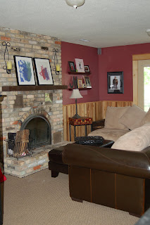

Source: House Beautiful - September 2009
Mickelson Residence - Lower Level Family Room